Showing posts with label professional photography. Show all posts

Tuesday, January 10, 2017

Courage Cube Loving Uplifting Gifts

I just completed a project for Rebecca Daoud founder of Courage Cube. She has suffered from chronic illness since age 29, read her story on her website at https://goo.gl/y5mDi3 (couragecube.com). Here are some of the product proofs done on white sweep. If you know a person or have a family member suffering from an illness, consider these gifts to support them.

Close ups of some of the included gifts.


Complete gift sets.


Basic catalog photos on white sweep that will be easy to knock out later for use on Amazon or mixed media advertising.

#product #photography #tampabay

Sunday, December 4, 2016

Busy Month in Studio and a word about Clipping Masks

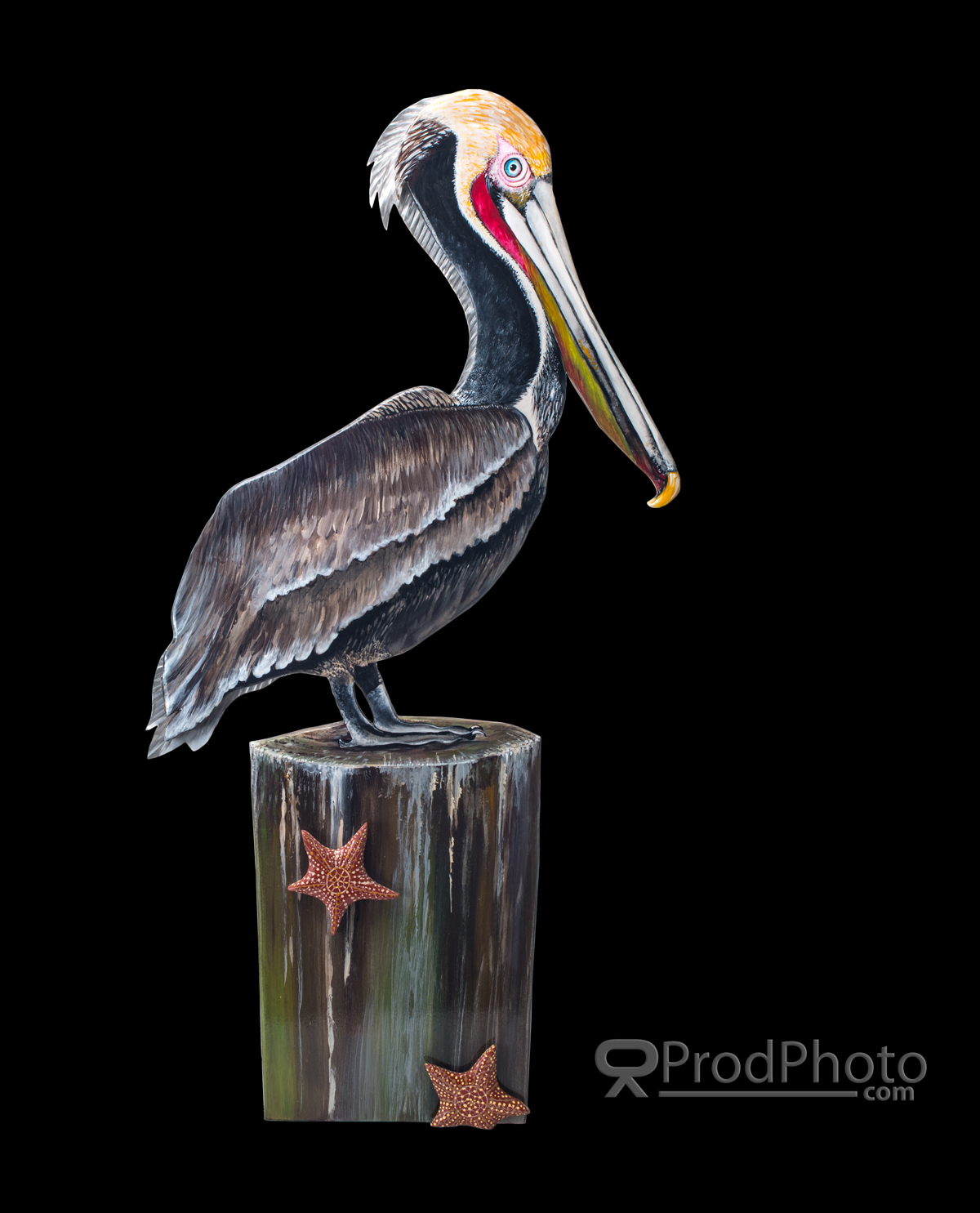
November has been a busy month for product photography. With Christmas right around the corner it's been a mixed bag of Amazon work and some specialty work. I have been doing quite a bit with clipping paths for custom ads and other uses.

 Clipping paths "knock out" the background
allowing the graphic artist to use special colors
or  images with the photo.

 Here I inserted a black background.

 Here a white background.

Here the product is left on the original white sweep.

Clipping masks do add a considerable cost to processing as I spend about an hour or two to take each image element away from its backdrop the more complex the image the more time involved.
When should you consider a clipped image? If your image will be printed on different colors like a coffee mug or a shirt; will be used in several different media like a printed ad or banner graphic with other graphic elements applied. I quote each project on an individual basis so fees do vary from image to image. Contact me through my website at www.ProdPhoto.com for more information or to request free quote.

Painted Sea Art from the collection of Jennifer Rogers.

Tuesday, July 26, 2016

Shooting for color accuracy!

Part of the challenge in product photography which seems less critical in other types of photography is getting the colors spot-on. Using color control software, color balanced lighting, calibrated monitors and camera gear can get you pretty close, but, sometimes you just have to physically match the resulting photos to the product. The following set were a battle because even a slight contrast change threw color accuracy out the window.

Light pastels can cause color control software
to try to boost the contrast to seperate the light tints
from the white elements increasing color saturation 
and color shift.


Here the hardest color to render correctly in JPG is usually full
saturation red.


I always guarantee correct color rendering in a given color space. Sometimes a brief discussion on color theory and monitor calibration with the client is necessary to explain why colors look different on their phone's screen from their desktop computer. More on color calibration here https://en.wikipedia.org/wiki/Color_calibration

Having trouble deciding weather to out-source or in-house your product photography?
Reading this article will help you decide. http://bit.ly/29U9VlO

Saturday, July 16, 2016

I have run into group of marketing articles which convey the importance of quality product photos rather than attempt to rewrite the information I thought I would just re-publish the links here. The message is, without fail, use the best quality photos you can be it DYI or commissioned from a professional.
Enjoy...


The Do's and Don't of Product Photography - http://bit.ly/29PmDog
Hiring a Professional Photographer to Photograph your Products - http://bit.ly/29L3QrH
How to Drive Sales With Effective Product Photography - http://bit.ly/29Y96cr
Why Presentation and Context Are Crucial to E-Commerce Product Photos - http://bit.ly/29OT9Go

Monday, June 6, 2016

Practice, practice, and even more practice

During the off season I like to try different looks to my photography, different lighting techniques, props, equipment and so on. Here are a few latest home brew projects using different techniques. Some of these styles are not commonly used in product work unless the art director is looking to establish a particular look and feel to the product.

 Single strobe firing into several white cards.

 White cards positioned off camera right, left and above

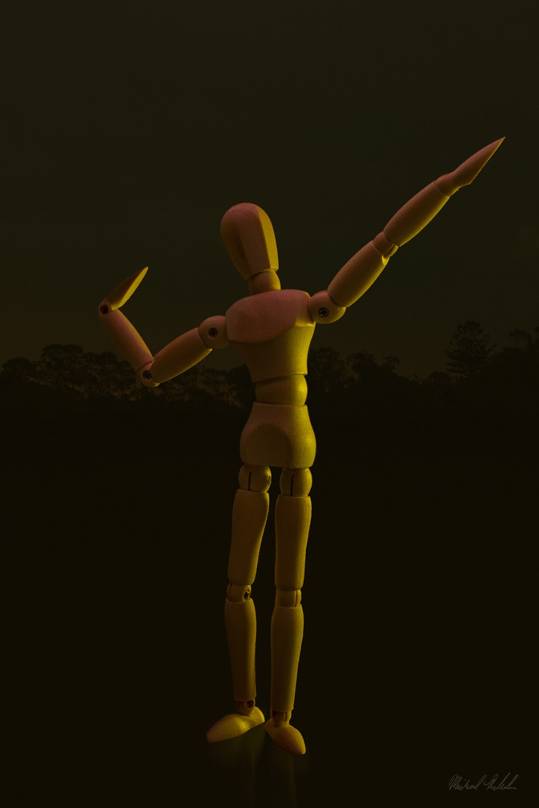
 Small yellow gelled strobe off camera 
right with a white card off camera left
The gel creates a warm almost retro look.

2 lights, strobe with a softbox overhead and
small bare strobe from left and behind.
Silver bounces off camera right and in front.
Photographed in B&W to make the lighting very prominent.


Also experimenting with ambient light and the light created by the subject.

Long exposure and high f-stops let the products own 
light come through without over exposing the stage.

and different light modifiers...

Single strobe with a 2x6 inch snoot focusing hard light 
on the subject and eliminating any spill on the stage.

Well that's it for now until the next break in the schedule when experimentation can begin again.

Wednesday, April 27, 2016

The better the photos the better the video!

When we think of a TV commercial we think of video cameras, video and audio, but, many a video commercial contain still photos edited into the script. With the advent of the 4k video camera, resolution is much better than in even the recent past. Digital still cameras, however, still out perform video cameras for dynamic range and detail.
4k (4x 1080p) still is only about 2160px X 1440px or about 3mp compared to a Nikon D90, a 7 year old camera with 12mp of resolution or a newer D610 at 24mp. Even though video can't render such high quality files on TV, the higher quality the starting files the better the result after down sizing.
Here are some shots commissioned by a video house for some up coming TV spots.


Shot on white as the editor want to add color to the backgrounds in post production.

Consider a professional product photographer as another resource in your marketing tool kit.

Friday, February 19, 2016

Those Darned Shinny Surfaces!

From jewelry to water filters(?) Package and product designers love to use clean polished surfaces to give the product an up-scale appeal and it works for the most part. Hey,lets face it, we love the shinny. It's amazing how human vision can cloud the details of what we really see for what we want to perceive. 
In a store we see the chrome cap on that bottle of cologne as a shinny silver embellishment. We seem to ignore the fact that that little piece of silver is mirroring back all the objects in the area. From the sales person to all the fixtures and lighting are reflected in this little mirror. Our eyes see this visual "noise" and our brains filter it out as extra information we don't need. Examine a photograph of that bottle taken in the same place and distance, suddenly we see all the little reflections and imperfections. Our eyes are drawn to them as a moth to a bright light. When we examine a photo our full attention is focused on the item without any other distractions. Our brain shifts gears and we begin to focus on the details of the product. 
As a product photographer it's my job to photograph that shinny without any distracting reflections and still show a shinny surface without the use of software fixes which tend look faked. I have spent years learning and experimenting with the shinny enough to know that each item presents it's own set of problems and solutions. Here is an example of a shinny object that, while not being a mirror, still reflects all that is around it.
A big shinny cylinder!

Keeping some of the unevenness in the reflections helps to define the objects shape and how smooth the surface.
Having trouble with your "shinny"? I can take out the stress of the shinny. Give me a call.  

Wednesday, January 20, 2016

Amazon Making Product Photography Difficult for DIY

Amazon has some pretty strict rules for the primary product shots making it very difficult for many DIY photographers. The Amazon photography guide is 4 pages long and very strict about how your product shots are composed. In a nutshell, your product must be laid out in a way that is consistent with how the product is worn, applies to jewelry and apparel. Must occupy 75% of the photo, be in complete focus, be at least 1000 pixels on the long side, and be on a pure white background. The are some more rules depending on your items. Additional photos beyond the initial product shot can use models, props, and environmental locations to highlight product features.
Product on pure white.

Of late, about 1/2 my work has been shooting to Amazon specs. Not as much fun as more stylized photography but a necessary part of the business.
Having trouble meeting the requirements? Give me a call and lets discuss your project.

Friday, October 23, 2015

Maker

It's nice to see that the Tampa Bay area has a strong community of inventors and entrepreneurs. Local inventors produce everything from medical appliances to pet products which brings me to our new client, Smarter Reefs, who make specialized aquarium gear for exotic fish needs. His patented fish feeder is made of clear acrylic polymers making for a challenging set of photos,  pure white background hi-key photos for the up coming web site. Here are the mounting base and feed tubes final shots.

Problem: how to separate the transparent edges from the background
Solution:Use split lighting on the background and subject


The final shot

Sunday, June 21, 2015

More on Dixie Belle Paints

Dixie Belle Paint is expanding their offerings almost every quarter as the demand for unique craft colors explodes. This company offers the highest quality artisan chalk paints on the market. This month 5 new colors hi the catalog: Holy Guacamole, Colonel Mustard, Cobalt Blue, Buttercream, and Lucky Lavender. Good thing we document our set and lighting. We can go back to any client shoot and recreate the exact same photos using the new product keeping the continuity between shoots the same. The catalog photos all look as if they were shot in the same session.  As always the client can download both TIFF and JPG files immediately and we always send a DVD with both formats and supporting documents by US mail.


Full set ready for the website and catalog.

Dixie Belle Paint can be purchased on-line at http://www.dixiebellepaint.com


Out of my Wheelhouse

I don't as a rule do any portrait work. But when a friend asks (low or no fee) what are you gonna do... Call Loyce Hood a dear friend who is a pro baby and portrait photographer. Her web blog is here....http://loycehoodphoto.blogspot.com/

Not much to say about the shoot except Loyce is very good at posing people(even difficult subjects who have an incorrect preconceived idea of what a good portrait of them is...). Because of the subject, I chose butterfly lighting with a hard hair light from above camera left and a white bounce board from camera right. This lighting tends to be more forgiving to the subject and skills of the photographer (did I mention I don't do portraits?). The lighting became more of a loop style of lighting because of the hair light. The advantage is the best of both worlds, some shaping of the face and de-emphasizing of the lines.  We worked through several different poses. The client chose the 3 she liked best from the shoot. After choosing the one with the best all around feel my work in Photoshop began. Here is the final presented to the client.


After post

Thursday, April 30, 2015

Imported Jewelry and Imaging for Amazon

With the explosion of jewelry vendors vying for Amazon's attention Amazon.com has had to tighten up what is considered the primary product image rules for acceptable use. Hence the 20 page long Jewelry Style Guide. While Amazon has always had these guidelines in place, certification staff has really been towing the line and images that may have squeaked by in the past won't cut it anymore.
White means white period. Not RGB 254,254,254 but 255,255,255, and sharp as a tack front to back. Quite a challenge when we are working with macro distances. This means shooting at f/22 or higher and requiring gobs of quality light only possible with very powerful (and hot) continuous halogen lights or pricey studio quality strobes.  We choose strobes. The halogen lights are so hot they overpower the A/C and heat the studio to uncomfortable levels in about an hour.
Following are an example of some rejected images.
 Wrong layout, focus, and not on white.

Not on white and focus.


All of the above would be ok for Ebay, Craig's List and other auction sites, but they fall short because of some technical flaws. We noticed the colors on the failed images were a bit off which may  have caused customer satisfaction issues because the images don't actually reflect the products true colors.
Here are the approved shots the client had us do after the in-house method failed. (Please note: there is always some color shifting because of individual monitor/browser rendering.)


Following the style guide the background measures
255,255,255 and everything is in focus. Colors
are calibrated and 100% accurate.


Sunday, March 1, 2015

and now for something completely different..

decals, and not just your everyday run of the mill standard flat bumper sticker types, these are 3D and look really special. The hard part is to make these look as good in a photo as they do in real-life. The task is to shoot the 4 colors on a neutral white  at several different angles to show off the raised texture unique to this product. The problem is to keep the background uniformly lit. 


Initial shot with minimal post processing. Notice the slight
color variation caused by a slight difference in the color
temperatures of the lights from left to right (cooler lamp
on the right). Something we'll fix in the finals.


The solution was to raise the decals on a glass sheet 6 inches above the background and light the subject and background separately. 2 lights for the product and 3 lights for the background. A mono-light with a 24 inch softbox from camera right to light the product and the right side of the background. A mono-light with a 2 inch snoot off camera left to provide hard shadows showing off the texture and spilling onto the left side of the background. Finally a speed light with a 12 inch softbox to smooth out any shadows on the background. 

The angles shots required a different approach. The background showed an annoying drop shadow from the samples so we placed the product directly on the white background material. This got rid of the drop shadow but required  more post processing in Photoshop.

The small shadow in this series helped bring out the 3D design.

Tuesday, January 13, 2015

We Love the Small Jobs

Small jobs usually afford much more creativity on the photographer's part because there is usually no creative director, art department or brand guides to follow. The budget just isn't there. These new entrepreneurs are usually a "one man band" doing all the work to launch a fledgling business. At some point the product needs to be photographed for the web, catalogs, and other advertising. These clients tend to rely on us for design and style choices unlike the more directed projects. These clients have a general idea for how the product should be presented but it falls on the photographer to bring the vision into focus. The job is to shoot the product and design a table stand graphic for use in various upscale salons.

Here the client supplied a photo of
where these displays will be used. 

The client vision was a silver toned image. We shot the product against a silk curtain leaving the folds in view  to give a slightly soft feel to a spartan design.

After a few trial product layouts, here is the final design.

The final display design.

Done in about a day, we had fun playing with the ideas and implementation.