Sunday, December 4, 2016

Busy Month in Studio and a word about Clipping Masks

November has been a busy month for product photography. With Christmas right around the corner it's been a mixed bag of Amazon work and some specialty work. I have been doing quite a bit with clipping paths for custom ads and other uses.

 Clipping paths "knock out" the background
allowing the graphic artist to use special colors
or  images with the photo.

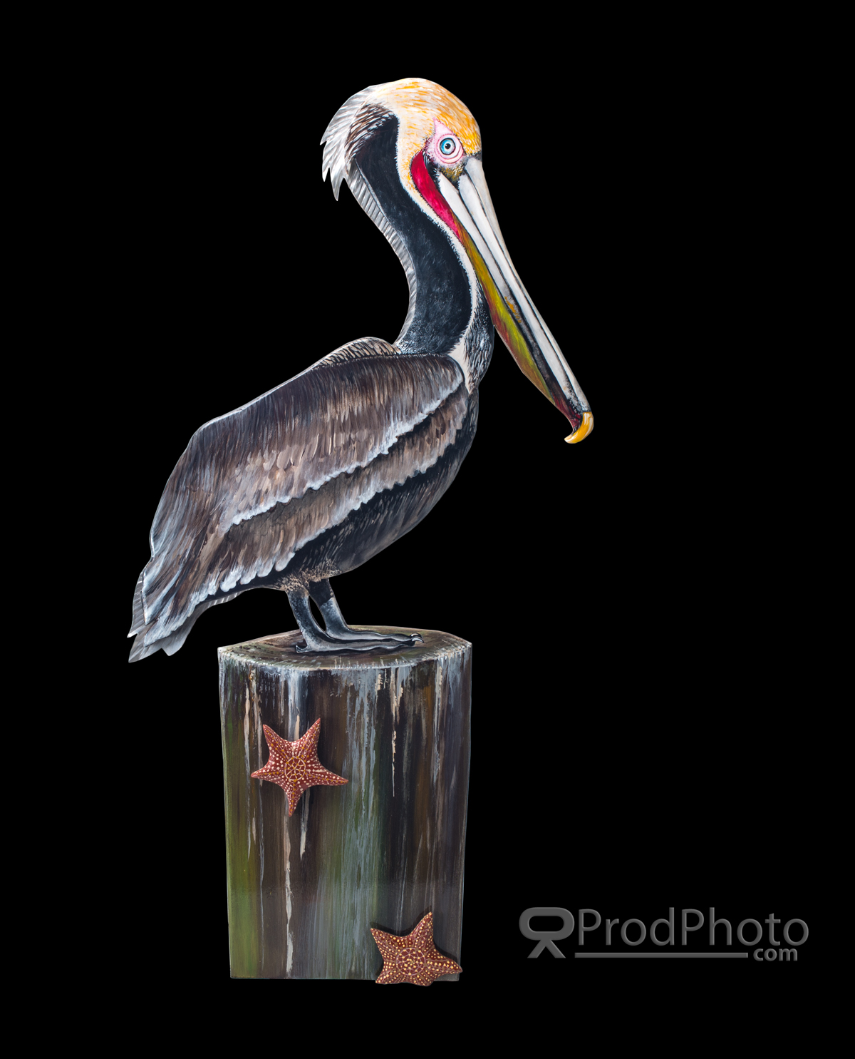
 Here I inserted a black background.

 Here a white background.

Here the product is left on the original white sweep.

Clipping masks do add a considerable cost to processing as I spend about an hour or two to take each image element away from its backdrop the more complex the image the more time involved.
When should you consider a clipped image? If your image will be printed on different colors like a coffee mug or a shirt; will be used in several different media like a printed ad or banner graphic with other graphic elements applied. I quote each project on an individual basis so fees do vary from image to image. Contact me through my website at www.ProdPhoto.com for more information or to request free quote.

Painted Sea Art from the collection of Jennifer Rogers.

Tuesday, July 26, 2016

Shooting for color accuracy!

Part of the challenge in product photography which seems less critical in other types of photography is getting the colors spot-on. Using color control software, color balanced lighting, calibrated monitors and camera gear can get you pretty close, but, sometimes you just have to physically match the resulting photos to the product. The following set were a battle because even a slight contrast change threw color accuracy out the window.

Light pastels can cause color control software
to try to boost the contrast to seperate the light tints
from the white elements increasing color saturation 
and color shift.


Here the hardest color to render correctly in JPG is usually full
saturation red.


I always guarantee correct color rendering in a given color space. Sometimes a brief discussion on color theory and monitor calibration with the client is necessary to explain why colors look different on their phone's screen from their desktop computer. More on color calibration here https://en.wikipedia.org/wiki/Color_calibration

Having trouble deciding weather to out-source or in-house your product photography?
Reading this article will help you decide. http://bit.ly/29U9VlO

Saturday, July 16, 2016

I have run into group of marketing articles which convey the importance of quality product photos rather than attempt to rewrite the information I thought I would just re-publish the links here. The message is, without fail, use the best quality photos you can be it DYI or commissioned from a professional.
Enjoy...


The Do's and Don't of Product Photography - http://bit.ly/29PmDog
Hiring a Professional Photographer to Photograph your Products - http://bit.ly/29L3QrH
How to Drive Sales With Effective Product Photography - http://bit.ly/29Y96cr
Why Presentation and Context Are Crucial to E-Commerce Product Photos - http://bit.ly/29OT9Go

Monday, June 6, 2016

Practice, practice, and even more practice

During the off season I like to try different looks to my photography, different lighting techniques, props, equipment and so on. Here are a few latest home brew projects using different techniques. Some of these styles are not commonly used in product work unless the art director is looking to establish a particular look and feel to the product.

 Single strobe firing into several white cards.

 White cards positioned off camera right, left and above

 Small yellow gelled strobe off camera 
right with a white card off camera left
The gel creates a warm almost retro look.

2 lights, strobe with a softbox overhead and
small bare strobe from left and behind.
Silver bounces off camera right and in front.
Photographed in B&W to make the lighting very prominent.


Also experimenting with ambient light and the light created by the subject.

Long exposure and high f-stops let the products own 
light come through without over exposing the stage.

and different light modifiers...

Single strobe with a 2x6 inch snoot focusing hard light 
on the subject and eliminating any spill on the stage.

Well that's it for now until the next break in the schedule when experimentation can begin again.

Wednesday, April 27, 2016

T-shirts and that hollow look

Clothing can be very challenging and expensive to shoot. Take that empty shirt floating on white look. That's where the garment looks like it is being worn but just floats there in a surreal pose with nothing inside.  Not hard to do with Photoshop and other image editing software. Dress the model in the outfit, photograph in front of a white background. Photograph fill in shots of the back collar and sleeves. Bring it all into Photoshop and 30 minutes later there is a garment floating in the air being worn by the invisible man(woman). I have done this before but the end result always is a bit, well, creepy...My personal preference is to leave the model in or just use a display mannequin designed for in-store use.
Shot to Amazon specs.

The better the photos the better the video!

When we think of a TV commercial we think of video cameras, video and audio, but, many a video commercial contain still photos edited into the script. With the advent of the 4k video camera, resolution is much better than in even the recent past. Digital still cameras, however, still out perform video cameras for dynamic range and detail.
4k (4x 1080p) still is only about 2160px X 1440px or about 3mp compared to a Nikon D90, a 7 year old camera with 12mp of resolution or a newer D610 at 24mp. Even though video can't render such high quality files on TV, the higher quality the starting files the better the result after down sizing.
Here are some shots commissioned by a video house for some up coming TV spots.


Shot on white as the editor want to add color to the backgrounds in post production.

Consider a professional product photographer as another resource in your marketing tool kit.

Friday, February 19, 2016

Those Darned Shinny Surfaces!

From jewelry to water filters(?) Package and product designers love to use clean polished surfaces to give the product an up-scale appeal and it works for the most part. Hey,lets face it, we love the shinny. It's amazing how human vision can cloud the details of what we really see for what we want to perceive. 
In a store we see the chrome cap on that bottle of cologne as a shinny silver embellishment. We seem to ignore the fact that that little piece of silver is mirroring back all the objects in the area. From the sales person to all the fixtures and lighting are reflected in this little mirror. Our eyes see this visual "noise" and our brains filter it out as extra information we don't need. Examine a photograph of that bottle taken in the same place and distance, suddenly we see all the little reflections and imperfections. Our eyes are drawn to them as a moth to a bright light. When we examine a photo our full attention is focused on the item without any other distractions. Our brain shifts gears and we begin to focus on the details of the product. 
As a product photographer it's my job to photograph that shinny without any distracting reflections and still show a shinny surface without the use of software fixes which tend look faked. I have spent years learning and experimenting with the shinny enough to know that each item presents it's own set of problems and solutions. Here is an example of a shinny object that, while not being a mirror, still reflects all that is around it.
A big shinny cylinder!

Keeping some of the unevenness in the reflections helps to define the objects shape and how smooth the surface.
Having trouble with your "shinny"? I can take out the stress of the shinny. Give me a call.  

Wednesday, January 20, 2016

Amazon Making Product Photography Difficult for DIY

Amazon has some pretty strict rules for the primary product shots making it very difficult for many DIY photographers. The Amazon photography guide is 4 pages long and very strict about how your product shots are composed. In a nutshell, your product must be laid out in a way that is consistent with how the product is worn, applies to jewelry and apparel. Must occupy 75% of the photo, be in complete focus, be at least 1000 pixels on the long side, and be on a pure white background. The are some more rules depending on your items. Additional photos beyond the initial product shot can use models, props, and environmental locations to highlight product features.
Product on pure white.

Of late, about 1/2 my work has been shooting to Amazon specs. Not as much fun as more stylized photography but a necessary part of the business.
Having trouble meeting the requirements? Give me a call and lets discuss your project.